 |
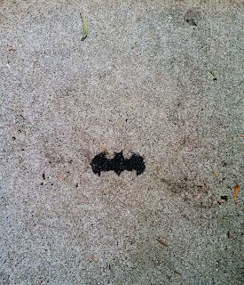
| My personal favorite photo |
Drew Photo Kyle
Wednesday, May 1, 2013
Monday, March 11, 2013
Latest Series
In this series, I took pictures utilizing negative space and trying to highlight the main subject of the photo by altering the lighting and color scheme. Black and white colors dominated this series since I wanted to try and make it my style, but I also left a few photos in color as I felt they highlighted the subject even more. Playing around with the lighting and saturation is something I definitely want to continue experimenting with.
Thursday, February 28, 2013
Next Series
In my next series, I will be experimenting with street photography in black and white. Black and white has worked well for me in my photos, and I have really grown attached to using it in my pictures. I will try to utilize depth and negative space to exemplify my photos. While editing my photos in Photoshop, I will experiment with hue and saturation alteration, as well as experimenting with different curve filters.
Thursday, February 21, 2013
Photo Series
 |
| The front of the school. Made black and white in order to embellish the darkness of the building to the sky. |
 |
| A side view of the school. |
 |
| A house on Sutter. Edited the color pattern in order to make the house stand out more. |
 |
| Picture of the street. |
 |
| Another shot of the street, but in color, with edited hue and saturation. |
 |
| Darkened streetlight in order to make it resemble a silhouette. |
 |
| Street shot darkened in order to convey depth. |
 |
| Heavily edited photo in order to express negative space. |
 |
| Another street shot conveying depth. |
 | ||||||
| Depth emphasis on the sidewalk. |
Sunday, February 10, 2013
Plan for the Week
My three ideas for my next series include:
1. Experimenting with motion, by altering shutter speed to create a mysterious mood.
2. Trying to imitate the photographer I studied last semester, Josef Sudek, again, to create a melancholic atmosphere.
3. Utilize negative space with people this time, perhaps to create a humorous mood.
Wednesday, February 6, 2013
Negative Space
This week, we were assigned to experiment using negative space. I used the sky quite often when using my shots, but also experimented with sidewalk and walls as well in order to exemplify the main subject of my photographs. I also played around with the lighting, contrast, and saturation in order to exemplify the subject as well.
Friday, February 1, 2013
Sketchbook Style Experimenting
This week, I wanted to experiment with a style of repetition and depth. I also edited by using curves to edit the saturation and lighting, something I have just gotten into the habit of doing with my photographs.
Subscribe to:
Posts (Atom)


